
THE ESSENTIAL
Choose wedding colors by starting with your venue and overall mood, then limit the palette to a primary color, 1 or 2 supporting shades, and a neutral.
- Use 3 to 5 colors when you include neutrals, metals, and greenery.
- Check every important shade in natural, indoor, and evening light before ordering.
- Let your venue, season, flowers, attire, and stationery share colors without making every detail identical.
- Reserve the strongest shade for small accents if it overwhelms the room or photographs too darkly.
The right palette depends less on a trend than on the venue’s fixed colors, the available light, and the materials you can source at your budget.
How do you start with your venue, vision, and wedding style?
Start by deciding how you want the wedding to feel and by photographing the venue’s permanent features. Your palette should support those surroundings rather than compete with floors, walls, carpets, chairs, or outdoor scenery.
How do you identify the mood you want?
Choose 3 to 5 mood words before selecting specific shades. Words such as relaxed, formal, romantic, modern, coastal, rustic, or colorful give you a filter for rejecting attractive colors that do not fit the event.
Next, collect examples that match the feeling rather than searching only for wedding images. A soft sage and ivory palette suits an airy garden mood, while burgundy, plum, and warm gold create a richer evening atmosphere. Write down the colors you see repeatedly, then remove shades that appear only once.
How can the venue’s existing colors guide you?
Identify the venue’s fixed colors in the walls, flooring, furniture, artwork, stone, wood, and outdoor landscape. Treat those colors as part of the palette, even if you cannot change them.
For a room with patterned carpet or bold wallpaper, use quieter linens and florals. In a plain white or neutral space, you can use stronger bridesmaid dresses, table runners, or ceremony flowers without creating visual clutter. Ask the venue for photos from the same season and time of day as your event.
How can you use the season and setting for inspiration?
Use the season as a starting point, not a rule. Flowers, foliage, daylight, and temperature affect which shades look natural and which materials remain available.
- Spring: Try blush, butter yellow, lavender, pale blue, soft green, or ivory. Use lighter fabrics and fresh greens to keep the arrangement from feeling heavy.
- Summer: Consider coral, cobalt, citrus, turquoise, terracotta, or bright white. Strong sunlight can make pale colors disappear, so add one medium or dark shade for contrast.
- Autumn: Look at rust, cinnamon, olive, burgundy, caramel, and deep navy. These colors work well with wood, candlelight, dried foliage, and textured fabrics.
- Winter: Combine pine, cranberry, charcoal, icy blue, silver, or warm cream. Test metallic finishes because silver, gold, and copper can look different under indoor lighting.
Your setting matters just as much. A beach ceremony may suit sand, blue, and sea-glass green, while a city loft can carry black, white, and one saturated accent.
How many wedding colors do you need?
Most weddings work well with 3 or 4 intentional colors, including a neutral. More shades are possible, but they need a clear relationship in tone, saturation, or placement.
Think in roles rather than a flat list. One primary color should appear most often, one or 2 secondary colors should support it, and a neutral should give the eye somewhere to rest. Greenery, wood, metallic finishes, and natural stone can function as visual materials rather than separate colors.
If you love several shades, group them into one color family. For example, dusty rose, mauve, and berry can read as one graduated pink family when the rest of the palette stays restrained.
How do you choose a primary color and build your palette around it?
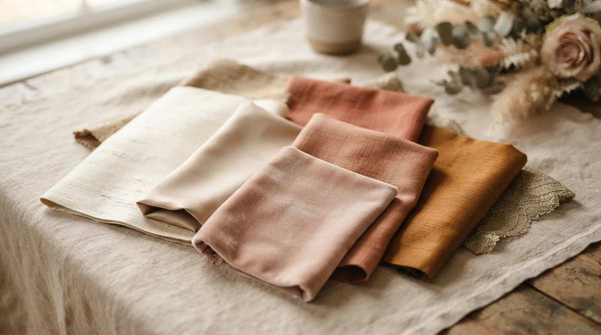
Choose the primary color from something you genuinely want to see often, such as a favorite flower, a fabric shade, a venue detail, or a meaningful object. Then test it on the surfaces where it will appear, because the same color can change substantially between satin, paper, velvet, paint, and fresh petals.
How should you add secondary colors, accents, and neutrals?
Use secondary colors to create depth and accents to direct attention. A practical starting ratio is 60% neutral, 30% primary or secondary color, and 10% accent, although flowers, foliage, and the venue may alter the balance.
Neutrals include ivory, white, cream, beige, taupe, gray, charcoal, and black. Pick a neutral that suits the venue and dress rather than automatically choosing bright white. Warm ivory beside a cool blue can feel softer than stark white, while charcoal may give pale colors enough definition for evening photos.
How can you use the color wheel to find harmonious combinations?
A color wheel helps you understand relationships between hues. Complementary colors sit opposite each other, analogous colors sit beside each other, and triadic palettes use 3 evenly spaced hues.
For an easy wedding palette, choose one dominant hue and pair it with an analogous shade plus a neutral. If you use complementary colors, let one lead and keep the other as a small accent so the combination does not feel visually loud.
The Color Matters guidance from the University of Washington’s Department of Communication explains that color meaning and perception depend on context, culture, and neighboring colors. Use the wheel to organize options, but judge the actual materials before committing.
How do you gather inspiration and narrow down your favorites?
Collect enough references to see patterns, then remove anything that does not work with your venue or budget. A useful collection includes outfits, flowers, rooms, stationery, tablescapes, art, landscapes, and fabric rather than only styled weddings.
How do you create a mood board?
Save 10 to 20 images and place them together on one digital or physical board. Add fabric swatches, paint cards, ribbon, a flower photo, a stationery sample, and a venue photograph if you have them.
Look at the board from a distance and name the 3 colors that appear most often. Remove duplicate shades, then label each remaining color as primary, secondary, accent, or neutral. This gives vendors a usable brief instead of a collection of unrelated inspiration.
Where else can you look for color ideas?
Look to paintings, travel photographs, architecture, fruit, books, ceramics, vintage textiles, and the natural landscape around your venue. A photograph of terracotta buildings might suggest rust, cream, olive, and faded blue more effectively than a wedding search result.
Keep a record of exact color references with your vendor notes. A simple document filing system for wedding planning can keep swatches, quotes, contracts, and inspiration images together.
Which wedding color palette ideas suit different styles and seasons?
| Style or season | Palette idea | Best use | Watch for |
|---|---|---|---|
| Spring garden | Blush, lavender, sage, ivory | Outdoor ceremony and soft floral arrangements | Pale shades may fade in bright sunlight |
| Summer coastal | Sea blue, sand, white, coral | Beach or waterfront setting | Too much blue can feel cold indoors |
| Autumn rustic | Rust, olive, cream, navy | Wood, foliage, and textured table settings | Dark colors need lighter linens or candles |
| Winter formal | Burgundy, charcoal, cream, gold | Evening reception and formal attire | Gold finishes vary under warm lights |
| Modern neutral | White, taupe, black, eucalyptus | Loft, gallery, or minimalist venue | Low contrast can disappear in photographs |
What practical details should you consider?
A beautiful palette still needs to work with availability, cost, comfort, and venue rules. Check the practical details before selecting a shade for a large quantity of items.
- Ask your florist which flowers are available in your season and whether the requested shade requires imported or dyed blooms.
- Request fabric swatches for bridesmaid dresses, tablecloths, napkins, and ribbons because online color displays are not reliable enough for matching.
- Confirm whether the venue supplies white, ivory, black, or colored linens, and price rentals before designing the tablescape.
- Choose readable text colors for invitations, menus, and seating charts. The Web Content Accessibility Guidelines recommend a contrast ratio of at least 4.5:1 for normal text, a standard checked in 2026.
- Consider skin-tone variety and comfort when choosing attire. A single shade may look different across fabrics, sizes, and lighting, so offer a style or color-family option when appropriate.
- Set aside a contingency for substitutions. A florist or rental company may need to replace a specific shade if supply changes.
For the reception menu and drinks, color should never replace food or beverage quality. If you are choosing bottles for the bar, these simple rules for choosing wine can help you plan flavor and quantity separately from label color.
How do you test your colors in real-world conditions?
Test the palette on real materials and in the actual venue whenever possible. A digital mood board can show relationships between colors, but it cannot predict how satin sheen, candlelight, or camera exposure will affect them.
How should you check swatches in different lighting?
Place your swatches together in direct daylight, shade, indoor white light, and warm evening light. Photograph them with the phone you expect to use for planning, then review the images without the screen brightness turned up.
Check the samples at least 3 times before ordering: during the day, after sunset, and beside the venue’s permanent colors. If a shade looks muddy, fluorescent, or too similar to the background in one setting, replace it or limit it to a small detail.
How will the colors look in photos?
Ask your photographer how they handle mixed lighting and dark receptions. Highly reflective metallics can create bright hotspots, while very dark navy, green, or purple may lose detail in shadows.
Make sure important items contrast with their background. A pale seating chart against an ivory wall may be attractive in person but difficult to read in photographs and for guests with limited vision.
Should you use a wedding color palette tool?
A wedding color palette tool can help you compare combinations quickly, but it should generate options rather than make the final decision. Use one after you have identified your venue, mood, season, and preferred color family.
Save the tool’s results as references, then test the suggested colors on physical swatches. A quiz or generator cannot account for your venue’s lighting, flower availability, fabric texture, dress shade, or the exact tone of a rental company’s linens.
How can you apply your colors without matching everything?
Repeat the palette through related materials instead of giving every item the same shade. Variation makes the design feel intentional and prevents the room from looking like a single-color set.
Where should you use your primary, secondary, and accent colors?
Use the primary color on the elements guests notice most, such as attire, ceremony arrangements, or table flowers. Use secondary colors in linens, signage, stationery, and supporting flowers, then reserve the accent for ribbons, napkins, candles, escort cards, or small floral details.
- Primary: one visible anchor, such as bridesmaid attire or the main floral color.
- Secondary: supporting flowers, table linens, paper goods, or ceremony fabrics.
- Accent: small areas that add contrast, such as candles, ribbons, menus, or glassware.
- Neutral: backgrounds that keep the palette readable, such as ivory plates, natural wood, white paper, or charcoal text.
How do you coordinate attire, flowers, paper goods, and decor?
Match undertones and visual weight rather than demanding exact color matches. Matching wedding flowers and linens works best when one material carries the main shade and the other uses a related tone, texture, or neutral.
Give each vendor the same approved swatches and a short list of acceptable substitutions. Flowers naturally vary, and a florist may achieve a closer overall effect with several related blooms than with one exact flower color.
What common wedding color mistakes should you avoid?
Most palette problems come from choosing colors in isolation or ordering before testing them. Use this short check before signing off on designs.
- Do not copy a trend without checking whether it suits your venue, season, or clothing preferences.
- Do not use more than one dominant color in every category, or the room may lack a clear focal point.
- Do not rely on phone or laptop screens for final color matching.
- Do not select flowers before confirming seasonal availability and substitution policies.
- Do not use low-contrast text on menus, invitations, or signs.
- Do not make every item identical. Repeat the palette, then vary texture, shade, and scale.
- Do not forget the wedding dress, suits, venue furniture, and existing decor when judging the complete palette.
What is the final wedding color checklist?
Use this checklist before you approve stationery, attire, flowers, or rentals. Recheck prices, availability, and venue policies because those details can change after your first quote.
- Have you photographed the venue in the light expected on the wedding day?
- Can you name the primary color, supporting colors, accent, and neutral?
- Have you tested physical swatches on fabric, paper, flowers, and linens?
- Does the palette work in daylight, indoor light, and evening photographs?
- Have you confirmed flower availability and acceptable substitutions with the florist?
- Have you checked rental colors, minimum quantities, delivery charges, and cancellation terms?
- Can guests read every sign, menu, and seating chart without relying on decorative color alone?
- Have all vendors received the same color references and the date those references were approved?